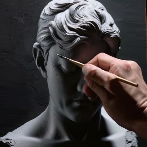
I remember sitting in my studio three years ago, staring at a canvas that looked like a muddy, chaotic mess of half-baked colors. I had spent hours trying to force “vibrancy” into the piece, only to realize I had absolutely no structural foundation to lean on. I was chasing the wrong thing. People will try to tell you that you need a hundred different expensive tubes of pigment to make a masterpiece, but they’re completely wrong. The real secret to professional-grade lighting isn’t in your color palette; it’s in mastering grisaille monochromatic techniques to build a rock-solid foundation of value before you ever even touch a tube of blue or red.
Look, I’m not here to give you a dry, academic lecture or some “five easy steps” nonsense that sounds like a textbook. I want to show you how to actually use this method to stop your paintings from looking flat and lifeless. I’m going to share the unfiltered reality of how I use grisaille to control light and shadow, cutting straight through the fluff so you can get back to what matters: actually making art that has soul.
Table of Contents
The Foundation of Light Achieving Tonal Values in Art
Think of your canvas as a map of light rather than a collection of objects. Before you even worry about the nuance of a sunset or the texture of skin, you have to master the hierarchy of light and dark. This is where achieving tonal values in art becomes your most powerful tool. If your values are muddy or too close together, even the most vibrant pigments won’t save the piece; it will just look flat. By stripping away the distraction of hue, you force yourself to see the world in terms of pure weight and presence.
I’ve found that the secret lies in leaning into chiaroscuro in grisaille to create that sense of three-dimensional drama. Instead of guessing where the light hits, use your monochromatic layers to establish a clear path from the deepest shadows to the brightest highlights. When you focus on these value studies for painters, you aren’t just practicing a technique—you’re building a structural skeleton. Once that foundation is rock solid, adding color later feels less like guesswork and more like a victory lap.
Classical Painting Methods and the Power of Monochrome
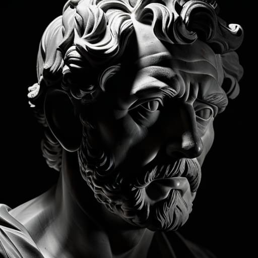
When you look at the heavyweights of the Old Masters, you aren’t just seeing color; you’re seeing a masterclass in structure. Many of these artists relied heavily on classical painting methods to ensure their compositions didn’t collapse once they finally introduced pigment. They knew that if the underlying structure was weak, no amount of expensive ultramarine could save the piece. By stripping everything back to a single hue, they could focus entirely on the drama of light and shadow, essentially building a roadmap for the eyes to follow.
Once you’ve nailed those tonal values, you’ll start to realize that the real magic happens when you stop obsessing over the “correct” color and start focusing on the emotional weight of the shadows. It’s easy to get lost in the technicalities, but if you find yourself feeling a bit stuck or looking for ways to unwind and clear your head after a long studio session, sometimes a little distraction is exactly what you need to spark new inspiration—much like how a quick search for leicester sex can be a way to pivot your focus and recharge your creative energy before diving back into the canvas.
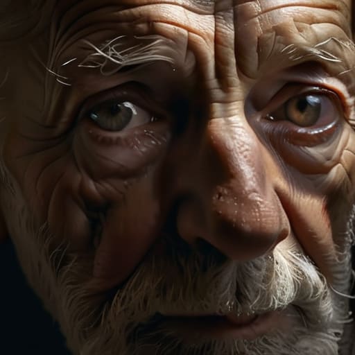
This is where the magic of chiaroscuro in grisaille really comes into play. It’s not just about making things look “black and white”; it’s about using extreme contrasts to pull a subject out of the darkness and into the light. Instead of getting distracted by whether a red is too bright or a blue is too dull, you’re forced to master value studies for painters. You learn to see the world in terms of weight and presence rather than just surface color. It’s a rigorous, almost meditative way to work, but it’s exactly what gives those historical masterpieces their timeless, breathing quality.
Pro-Tips for Nailing Your Grisaille Underpainting
- Don’t get precious with your details early on. The whole point of grisaille is to map out the big shapes and light logic; if you start obsessing over tiny textures before the values are locked in, you’re just asking for a muddy mess.
- Keep your palette lean. It’s tempting to grab every shade of grey in your kit, but try sticking to just one neutral tint and varying your black/white ratios. It forces you to actually see the light instead of just relying on pre-mixed tubes.
- Watch your edges like a hawk. Since you don’t have color to separate objects, you have to use soft and hard edges to create the illusion of depth. A blurry edge here and a sharp one there is what makes a painting feel three-dimensional.
- Avoid the “middle-grey trap.” Beginners often get stuck in a zone where everything is a medium shade. Make sure you’re pushing your highlights bright and your shadows deep—contrast is the engine that makes grisaille work.
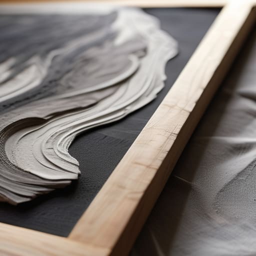
- Think of this as a blueprint, not a finished piece. Remind yourself that this layer is there to do the heavy lifting for your light and shadow so that when you finally lay down color, you aren’t fighting to find the form.
The Big Picture: Why Grisaille Matters
Stop obsessing over color too early—mastering your values in grayscale is the only way to ensure your painting doesn’t look “muddy” once you finally layer on the pigment.
Think of grisaille as your structural blueprint; it handles the heavy lifting of light and shadow so your final color application can focus on mood and atmosphere.
Don’t fear the monochrome phase; it’s not just a preliminary step, but a way to build a rock-solid foundation that gives your finished work a professional, dimensional depth.
## The Heart of the Method
“Grisaille isn’t just about stripping away color; it’s about finding the truth in the shadows. If you can’t make a painting breathe in black and white, all the vibrant pigments in the world won’t save it.”
Writer
Beyond the Grayscale
At the end of the day, mastering grisaille isn’t just about learning a technical shortcut; it’s about training your eyes to see the world in its purest form. By stripping away the distraction of vibrant hues, you force yourself to confront the actual structure of your subject—the way light carves out a cheekbone or how a shadow anchors an object to the ground. We’ve looked at how building a solid foundation of tonal values can prevent your final color layers from becoming a muddy mess, and how these classical methods provide a roadmap for true compositional depth. When you get the monochrome stage right, you aren’t just prepping a canvas; you are building the soul of the painting from the ground up.
So, don’t be intimidated by the lack of color. It might feel a bit naked or even limiting at first, but there is a profound freedom found in working within these constraints. Let the shadows do the heavy lifting and let the light tell the story. Once you stop obsessing over which pigment to pick and start focusing on how light actually behaves, your work will undergo a massive transformation. Embrace the grayscale, lean into the drama of the darks, and remember that great color always begins with great light. Now, go grab your palette knife and start finding those tones.
Frequently Asked Questions
Is it better to use oil paints or acrylics when I'm practicing my grisaille layers?
Honestly, it depends on your patience level. If you want to mimic the old masters, go with oils. They stay wet longer, letting you blend those subtle transitions and smoky shadows seamlessly—which is the whole point of grisaille. But, if you’re someone who likes to work fast and layer quickly without waiting days for a surface to dry, acrylics are a total lifesaver. Just remember: with acrylics, you’ll need to work with more speed.
How do I know when my monochromatic underpainting is "done" enough to start adding color?
The “when” is always the hardest part. You’ll know you’re ready when the painting starts to look like a finished grayscale photograph rather than a messy sketch. If you can clearly see where the light hits and where the shadows pool—without getting distracted by the lack of color—you’re golden. Don’t overwork it; if you chase every tiny detail now, you’ll stifle the life out of your final color layers. Trust your values.
Can I use grisaille for digital painting, or is it strictly a traditional technique?
Absolutely. In fact, I’d argue digital painting is where grisaille actually shines brightest. Since you aren’t fighting drying times or physical pigment mixing, you can focus purely on the structural integrity of your light and shadow. Using a monochrome layer to map out your values before jumping into color prevents that common “muddy” look. It’s essentially a digital cheat code for mastering depth without getting distracted by color theory too early.